Market Timing Indicator (MTI) examples since 1996 based
on Oversold conditions
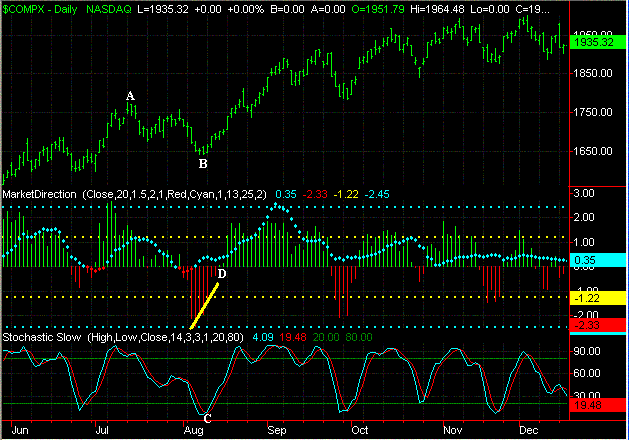
2003
In 2003 the Nasdaq basically remained in an extended up
trend. During July and August some selling pressure developed (points A to
B) but eventually the selling pressure diminished (upward sloping yellow
line). In addition the %K Line dropped below 20 and eventually rose above
its %D Line (point C). Meanwhile the Red Bars switched color and became a
Green Bar as Buying Pressure increased (point D). During the next two
months the Nasdaq rose from 1650 to 1900 for a gain of 250 points.
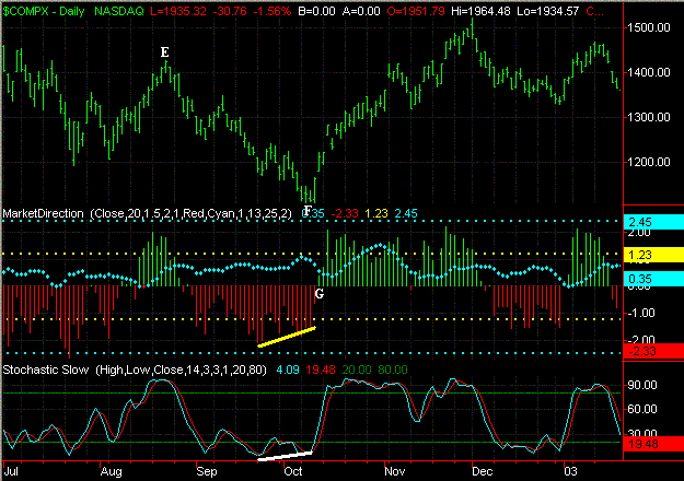
2002
As the Nasdaq continued to sell off in 2002 (points E to F)
eventually the selling pressure began to slowly decrease (upward sloping yellow
line). In addition the %K Line began to slope upward as the Nasdaq
continued to go lower (upward sloping white line). Meanwhile the Red
Bars eventually changed color to a Green Bar as Buying Pressure began to
increase (point G). During the next two months the Nasdaq rose from
1100 to 1500 for a gain of 400 points.
2001
The Nasdaq was in the middle of a Bear market in 2001 and
continued to fall for several weeks (points H to I). However eventually
enough signals came together to signal a nearing bottom as the Selling Pressure
began to decrease (upward sloping yellow line) and the Red Bars eventually
changed color to a Green Bar (point J). In addition the %K Line crossed
above its %D Line as well. During the next four weeks the Nasdaq rose from
1700 to 2200 for a gain of 500 points.
Another thing to notice in this example was that as the Nasdaq
continued lower during the early part of 2001 that the Red Bars never changed to
a Green Bar even though the %K Line crossed above the %D Line in association
with the Slow Stochastics on several occasions (points K). This is why
it's important to see the Red Bars change color to a Green Bar in conjunction
with the %K Line rising above the %D Line to confirm a change in direction of
the market.

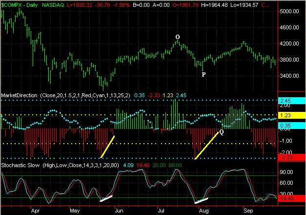
2000
In 2000 the market was transitioning from a Bull Market to a
Bear Market however two strong rallies occurred. The first occurred in the
early Summer after the Nasdaq had been under an extended period of selling
pressure (points L to M). The Selling Pressure eventually diminished
(upward sloping yellow line) as the %K Line began to trend upward as well (solid
white line). Meanwhile the Red Bars eventually changed to a Green Bar as
Buying Pressure developed (point N). Over the next few weeks the
Nasdaq rose from 3300 to 4000 for a gain of 700 points.
The second rally occurred late in the Summer after the Nasdaq
dropped about 600 points (points O to P). In this case the Selling
Pressure gradually decreased (upward sloping yellow line). Furthermore the
%K Line also began to trend upward as well (solid white line) while the Red Bars
changed color to a Green Bar (point Q). During the next 3 weeks the
Nasdaq rose from 3800 to 4200 for a gain of 400 points.
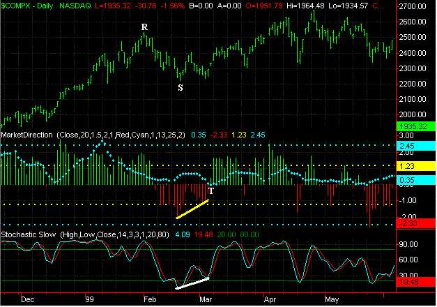
1999
In 1999 the market was still in a Bullish Phase although some
selling pressure occurred early in the year (points R to S). Eventually
the Selling Pressure diminished (upward sloping yellow line) as the %K Line also
began trending upward (solid white line). Meanwhile the Red Bars
eventually changed color to a Green Bar as Buying Pressure increased (point
T). During the next six weeks the Nasdaq rose from 2250 to 2600 for a gain
of 350 points.
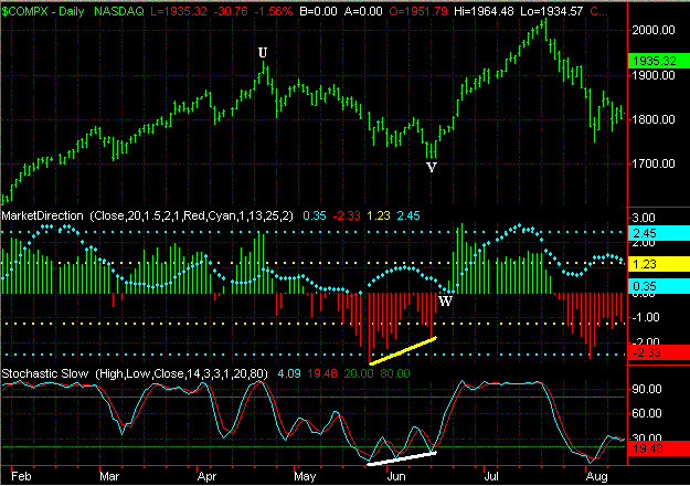
1998
The market was acting strongly in the early part of 1998 but
came under some selling pressure in the Spring (points U to V).
Eventually the longer term trend of the Selling Pressure diminished (solid
yellow line) while the %K Line began trending upward (solid white line) as the
Nasdaq continued lower. Meanwhile the Red Bars switched color to a
Green Bar as a bottm was reached and Buying Pressure developed (point W).
During the next two months the Nasdaq rose from 1750 to 2100 for a gain of 350
points.
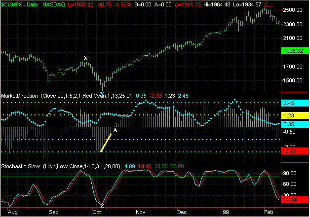
Meanwhile in the Fall of 1998 more selling pressure developed as
the Nasdaq fell from 1750 to 1400 (points X to Y). However eventually the
selling pressure began to decrease (upward sloping yellow line). Meanwhile
the %K Line dropped below 20 and then crossed above its %D Line (point Z) while
the Red Bars changed color to a Green Bar (point A). During the next
four months the Nasdaq rose from 1500 to 2500 for a gain of 1000 points.
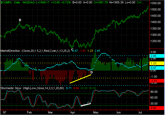
1997
In the early part of 1997 there was quite a bit of selling
pressure (points B to C) however by the Spring it began to decrease (upward
sloping yellow line). In addition the %K Line also began to trend upward
as well (solid white line). Finally the Red Bars changed color to a Green
Bar as the Buying Pressure increased (point D). During the next
three months the Nasdaq rose from 1200 to 1500 for a gain of 300 points.
1996
The Nasdaq was under some selling pressure during the early part
of 1996 (points E to F) but eventually it decreased (upward sloping yellow
line). Meanwhile the %K Line also began to trend upward (solid white line)
as the Nasdaq got close to a bottom. In addition the Red Bars changed
color to a Green Bar as Buying Pressure developed (point G). During the
next five weeks the Nasdaq then rose from 950 to 1120 for a gain of 170 points.

The main things to notice in these examples as the market
becomes oversold and is nearing a bottom and upside reversal are the following:
1. The %K Line in association with the Slow Stochastics
first drops below 20.
2. The amount of Selling Pressure begins to diminish (depth of successive
Red Bars decreases).
3. The %K Line in association with the Slow Stochastics is sloping upward
as the market is nearing a bottom.
4. The %K Line crosses above the %D Line and rises above 20 in association
with the Slow Stochastics.
5. After a series of successive Red Bars (Selling Pressure) the color
changes to a Green Bar which is indicative if increasing Buying Pressure.
Click
Here to see what our current Market Timing Indicator (MTI) is showing for the
Major Averages
|