MOVING AVERAGES
MARKETS
Following Moving Averages and Chart Patterns in the markets is no different than those of stocks. Lets look at some examples.

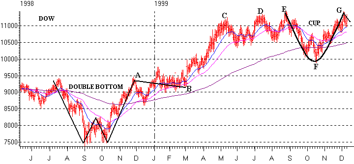
The chart of the DOW over the past 18 months shows plenty of volatility. Notice there aren't many occurrences when the DOW has tested the 200 day EMA (brown line) but when they did occur in the Fall of 1998 and 1999 they actually dropped below the 200 day EMA. However each time this occurred the DOW rallied strongly out of a certain chart pattern. In the fall of 1998 the Dow made a Double Bottom "W" shape (chart patterns work the same whether it's a stock or a market average). Notice when the DOW made the Double Bottom it then traded sideways for three months (points A to B) and then broke out in March and remained above the 21 day EMA (blue line) as it rose from 9500 to over 11000 (points B to C). After making a top in May of 1999 the DOW retested this high two other times (points D and E). Notice that in late August after rallying for a third time the DOW ran out of steam and corrected sharply back to below its 200 day EMA (point F). During the months of October and November the DOW formed a Cup as it rallied from 10000 to 11500 (points F to G) and began to form a Handle in the month of December.

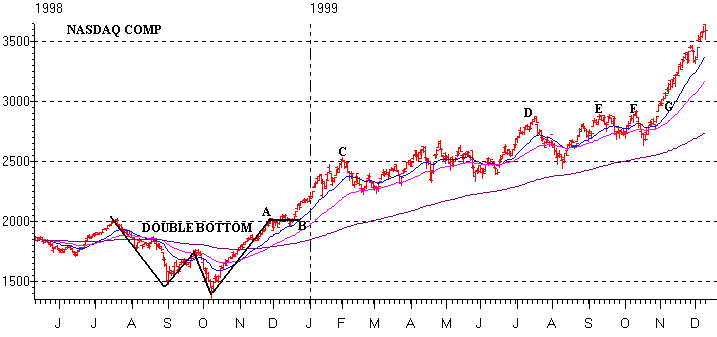
The NASDAQ Composite chart for the last 18 months is similar to the DOW in some instances but has shown some differences. Notice that both the DOW and NASDAQ performed similarly in the Fall of 1998 as the NASDAQ also dropped well below its 200 day EMA. It also formed a Double Bottom and then based for four weeks (points A to B). The NASDAQ then broke out of the base in mid-December and rose 500 points by early February (point C).
However notice what happened in the next four months from February through May. The NASDAQ basically traded sideways and only gained 200 points while the DOW exploded from 9500 to 11000 during the same time. From mid-July to mid-October both markets went through a correction however the Dow corrected much more than the NASDAQ. Also notice that the NASDAQ has not tested its 200 day EMA (brown line) in over a year and has only dropped below its 50 day EMA (purple line) on a few occasions. Recently the NASDAQ has taken off on another explosive move after it broke out of a trading range in early November and has remained above its 21 day EMA (blue line). Notice how the NASDAQ tested its high in mid-July (point D) two separate times this Fall (points E and F) before breaking through on the third time (point G).

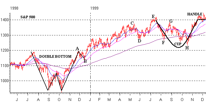
Finally lets look at the S&P 500 Index. Notice that it too looks very similar to the Dow and NASDAQ back in the Fall of 1998. It also made a Double Bottom and then had a weak pullback for 4 weeks (points A to B) before breaking to new highs in late December. The S&P 500 then remained in an up trend through the Spring of 1999 and remained at or above its 50 day EMA (purple line). The S&P 500 then made a top in mid-May (point C) and then retreated back below its 50 day EMA (point D). However it didn't drop back to its 200 day EMA (brown line) and then rallied to make a new high in mid-July (point E). After topping out in mid-July the S&P 500 sold-off sharply and dropped all the way back to its 200 day EMA (point F) and then bounced off this suport level and staged a four week rally (point G). However more selling occurred in September and October which dropped the S&P 500 below its 200 day EMA (point H). The S&P 500 then rallied with the rest of the markets in November and formed a Cup while in December the S&P 500 began to form a Handle.
As you can see Moving Averages and Chart Patterns work well for both the markets and stocks. By understanding what the markets are doing should help determine when to buy or sell a stock You certainly don't want to buy a stock when the markets are beginning a correction or sell a stock when the markets may be coming out of a correction and headed upward again.